
Process: Ronnie Scott's Jazz Club Anniversary Poster
16 July 2019
Back at the start of June I was approached by Ronnie Scott's Jazz Club and asked to illustrate and design a poster for their upcoming 60th Anniversary celebrations. They were holding a street party and they wanted a poster that was lively, full of energy and reflective of the club's location in wild, diverse Soho.
This was, in many ways a perfect commission. I have a thing for old band posters, I love the vibrancy of live music, I love drawing people having a good ol' time and it was Ronnie freakin' Scott's Jazz Club! (After the work is done, I'm still super excited by working with them).
I thought I'd share a little bit of the behind the scenes process, my rough workings and some snaps of the poster out in the wild.
The project began, like all good projects do with a discussion over the brief. They sent me a written brief, detailing what they would like and after a little bit of email ping-pong where I asked a few more questions, I went away to work on the rough sketches.
With any commission I tend to like to offer about three ideas for consideration. These serve as a good jumping off point for the brief and ensure that me and the client / art director are on the same wavelength. Sometimes one of these initial roughs fits the bill, other times there's a little more back and forth to get it right. I'm always happy to work with the art director to realise their vision of the work.
Option 1
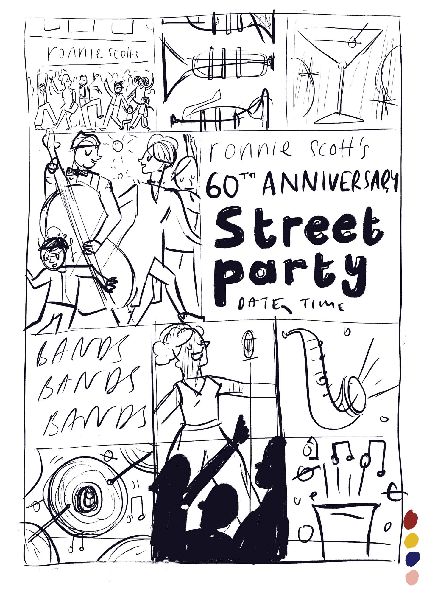
Because it was a 60th anniversary, and because it was a jazz club I thought something a bit mid-century and retro would be fitting. I like playing around with grid patterns too.
Option 2
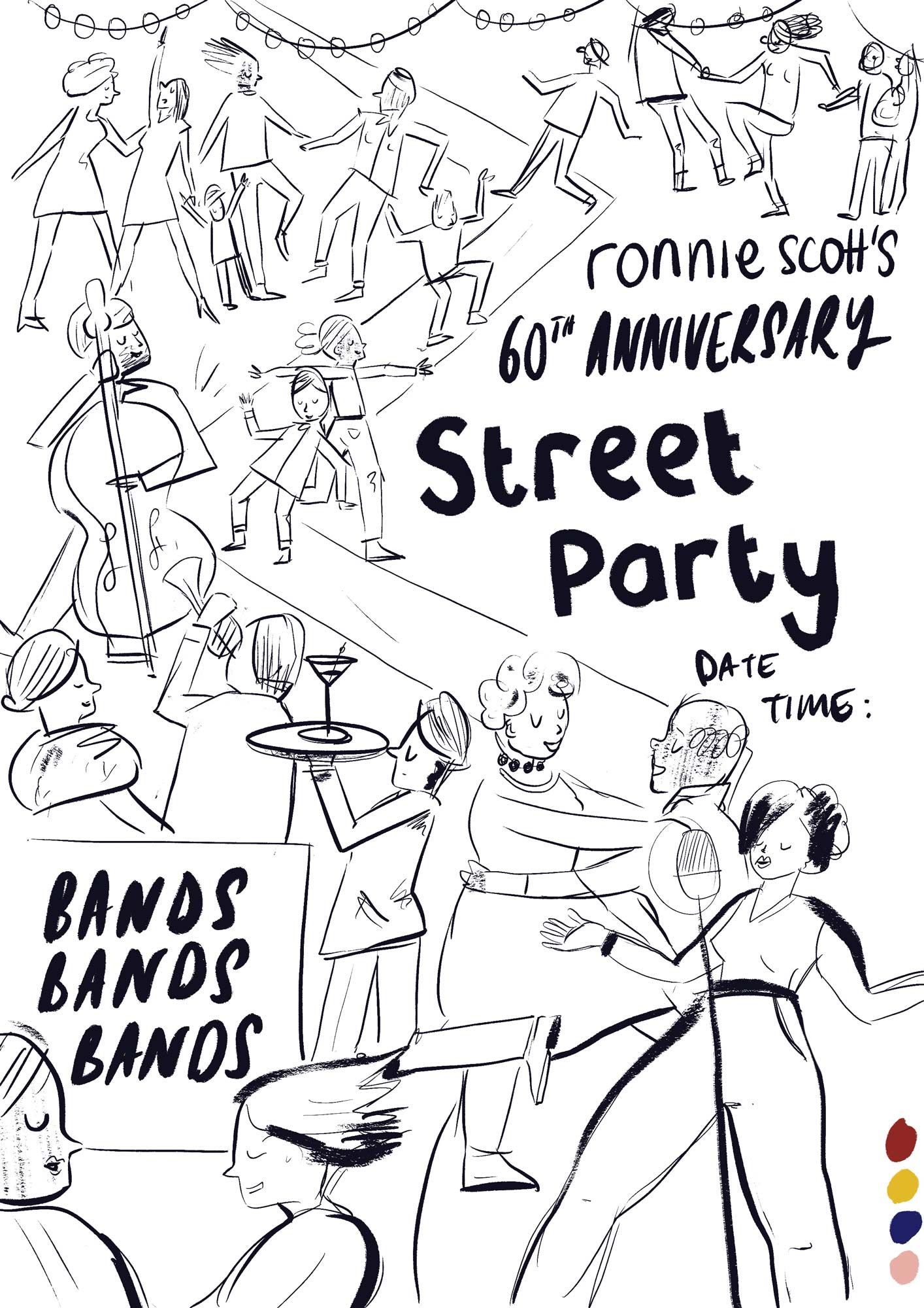
I still wanted to have a little mid-century nod with the people on this one - slightly angular funky people. I love drawing large crowds of people having a good time. A stylised 'street' running down the middle draws your eye through the poster and provides some balance.
Option 3
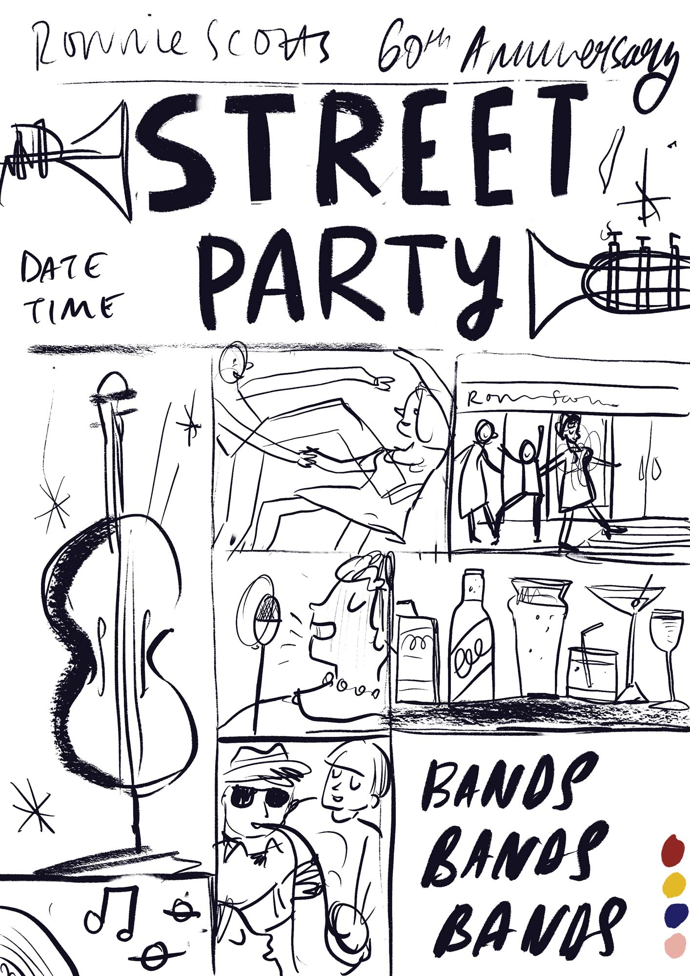
I couldn't get away from the grids, could I? Maybe this is more a variation on a theme, but I really liked it. I'm a fan of the trumpets blowing the letters out for the title.
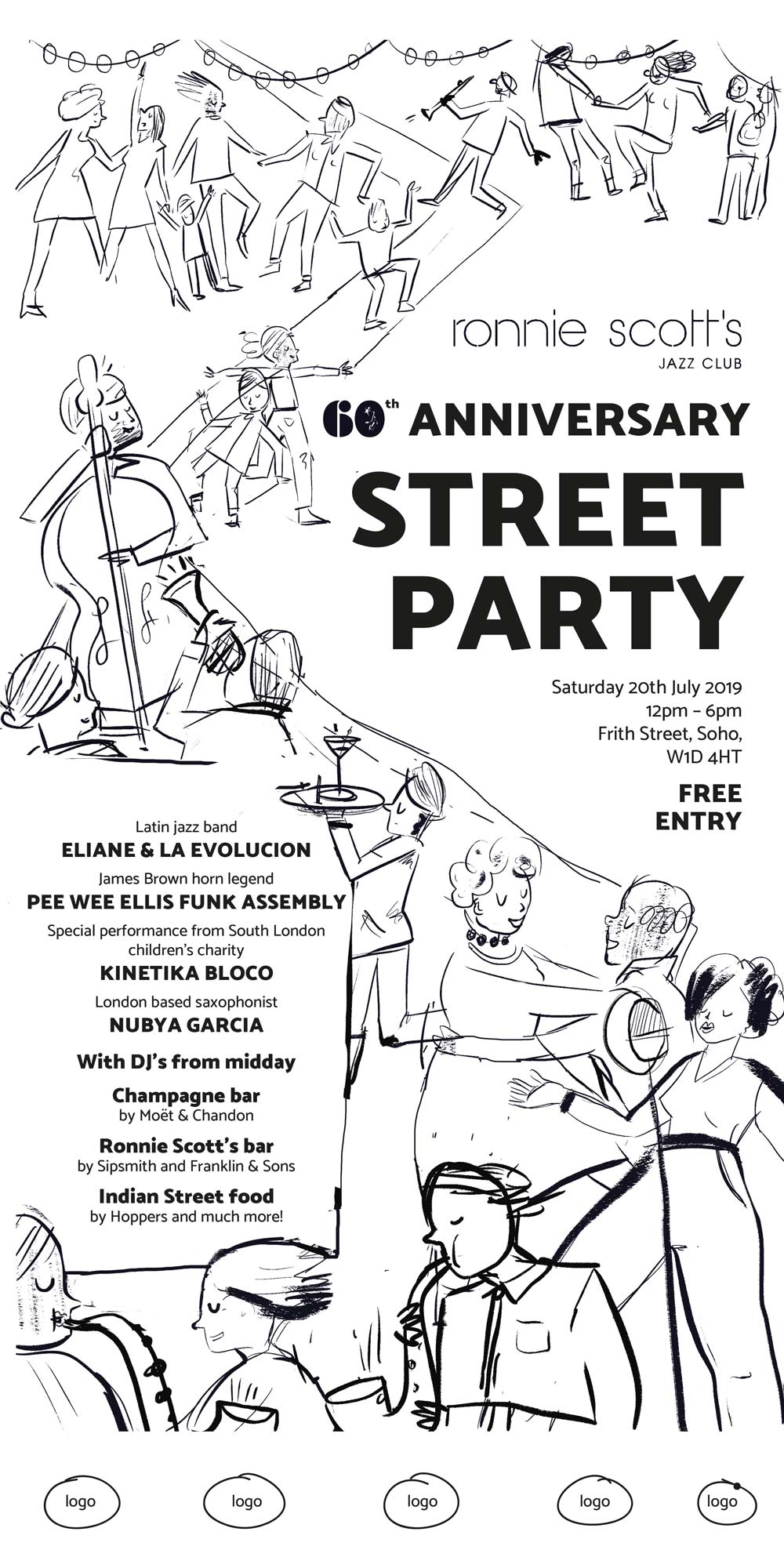
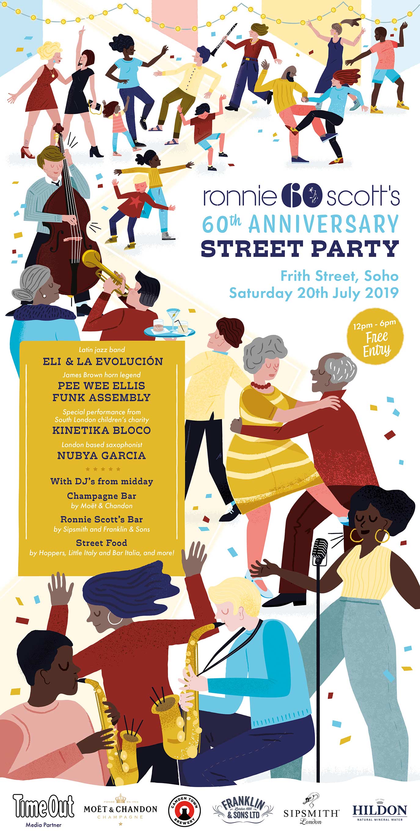
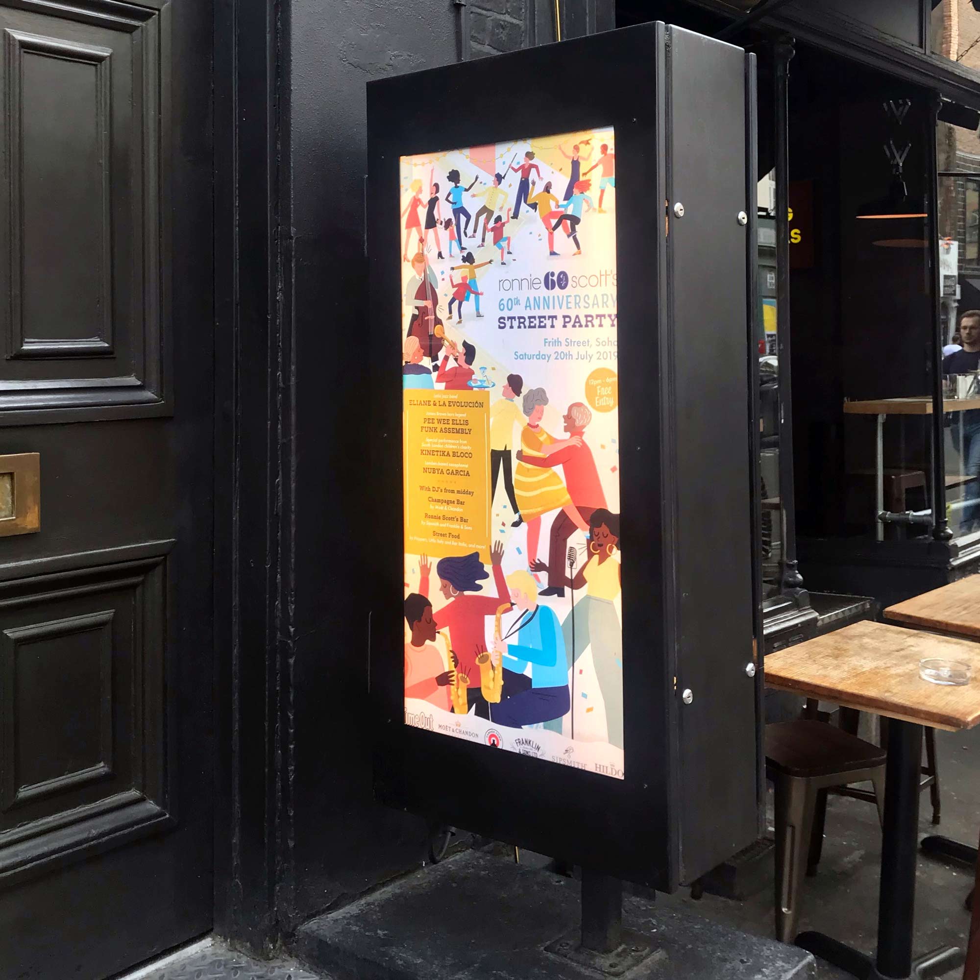
I was really pleased when option 2 was picked - it was my favourite one and I don't need an excuse to draw people. There were a few tweaks - they would have liked more instruments. They also provided me with the finalised set list at this point, so I was able to come back with a more final drawing showing the design. I also adapted it to fit the lightbox dimensions outside the club as this would be the largest use of the poster.
Final Rough
Aside from a few tweaks to the hierarchy of the copy this was signed off and I was free to crack on with the final. There was a reasonably sharp turnaround for this as I had several days to get the final done but not short enough that I felt like I was cutting corners. It was really nice to get stuck in to this.
I'm always trying new ways of working with the aim of improving my productivity. I produced the roughs on procreate on my ipad pro, which I've not really done before. It was so much quicker working that way and allowed me to make amends with no fuss. No coaxing my ageing scanner to play ball either, which is a bonus (it hates windows 10 and has thrown a wobbly ever since I updated my OS).
From my ipad roughs I moved to Adobe Illustrator to create the final. A key requirement of this brief was the ability to use the illustration in multiple formats - this meant anything from lightboxes, A5 brochures and giant street banners. Making the illustrations using vectors was the best way of achieving that. I had recently got hold of some fantastic vector textures which I was excited to use, to ensure that the final artwork didn't look too slick.
The Final Illustration
Outside the club
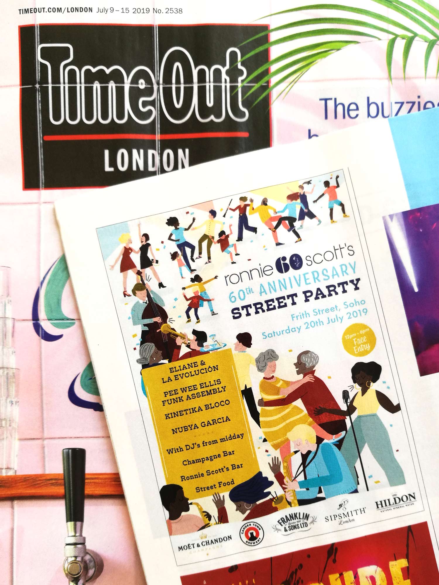
In Time Out
I'm really happy with how it has turned out. Thank you to Emma and everyone else at Ronnie Scott's who got behind me on this brief.