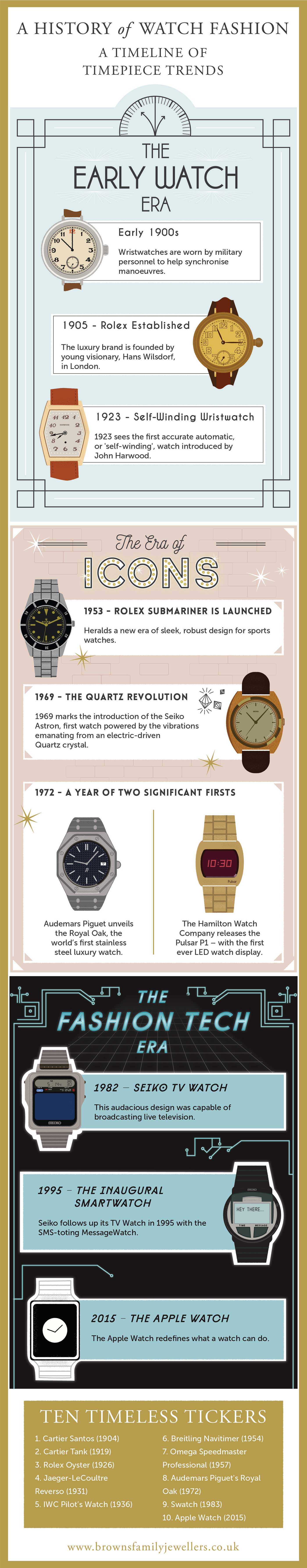
One of the projects I've been working on lately was an infographic for a Jewellers to show how the history of watch design has evolved over the last 100 years. Infographics are a great way of promoting a cause, or a business. If you have an idea or a cause that you think would make a great infographic drop me a line.
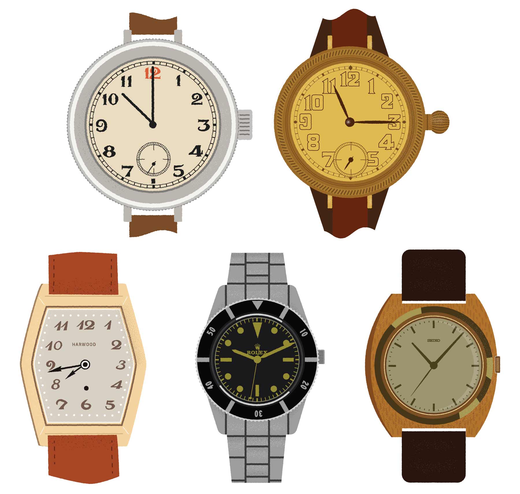
I really enjoyed the challenge of this illustration - watch design isn't an area I know much about, so I had to do a lot of research into the appearance of these watches. Getting stuck into the research and making my illustrations as accurate as possible while retaining a certain style made this project appeal to me. Plus, who doesn't like designing an infographic every now and then?
I love the distinct styling on the faces that the old watches have - the type on some of the numbers was excellent, not to mention the ornate craftsmanship that went into each item.
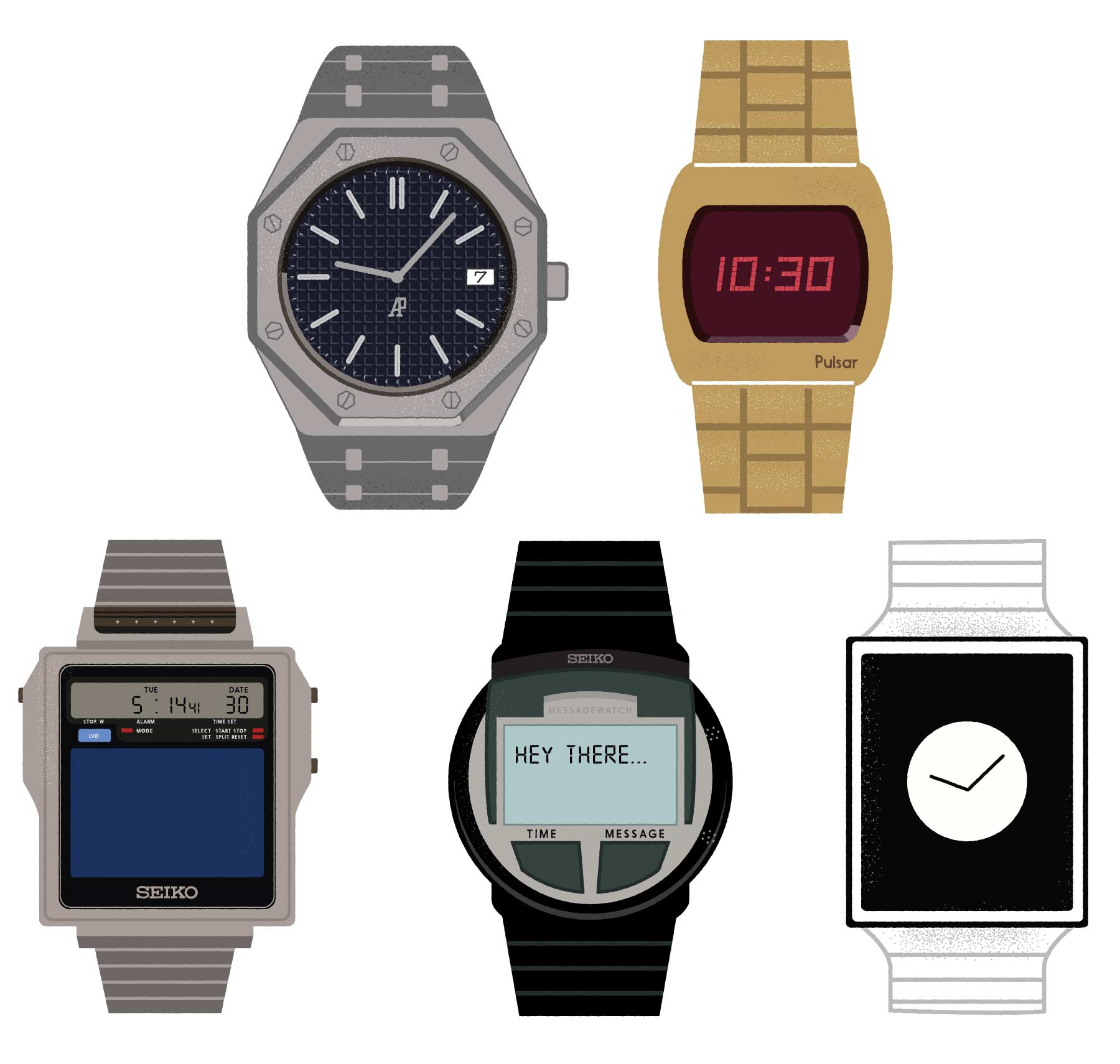
As the years go on, the designs of the watches get less ornate and more techy. How cool is the Seiko TV watch? Crazy to think that this came about in the 80's.
Below is the full infographic. Hopefully you'll learn something new.